
LOVING CARE FOR
THE LITTLE ONES
When Rainbow, the 12-year old hospital for women and children wanted a brand revamp, we gave them a logo that conveyed their essence – a wide spectrum of services that adds the vibrance of good health to lives – at a glance. Our BrandTale for them,
For precious new beginnings, spoke reams about the care, competence, comfort & compassion facets of their offerings.
A vivid range of colours was chosen, each one handpicked for its symbolism – going from warmth to passion to wisdom to renewal and well-being. The stylised arch stood in for the rainbow.
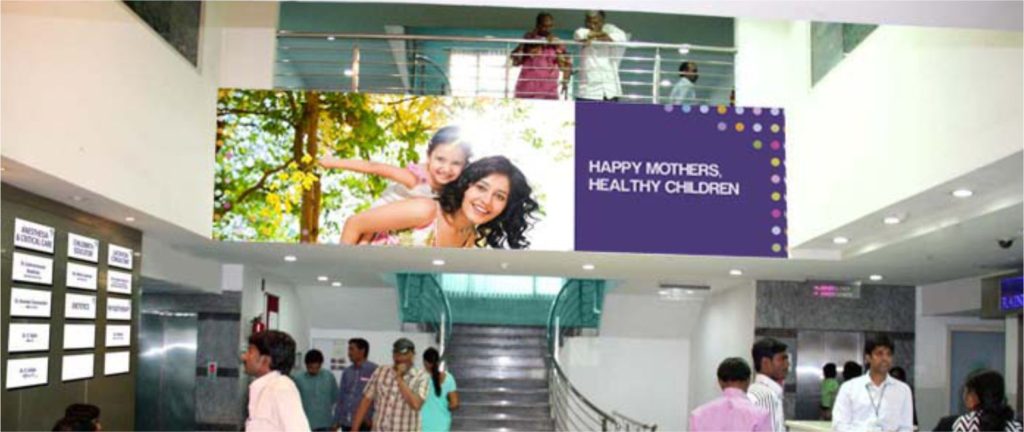
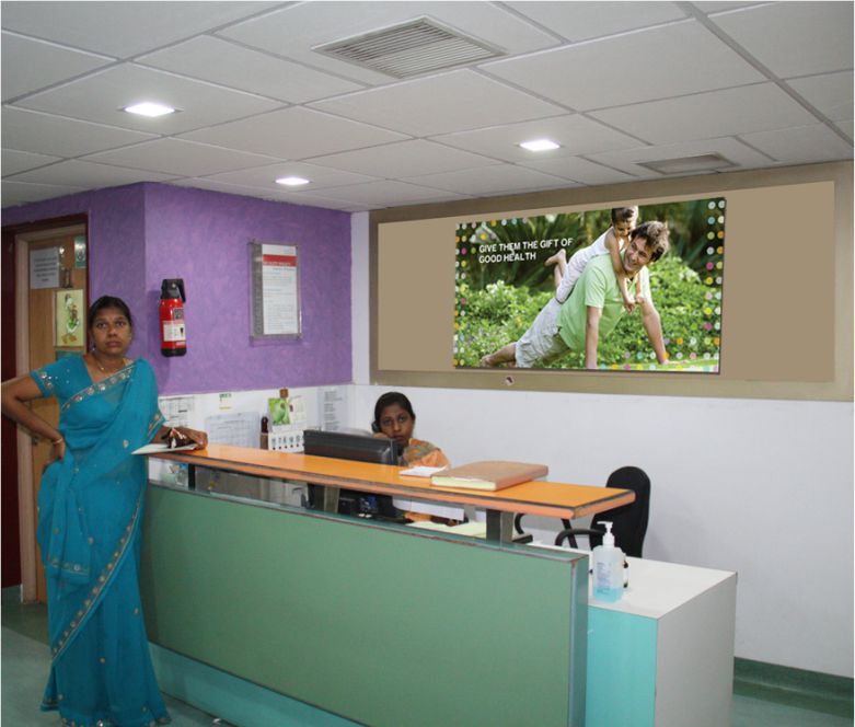
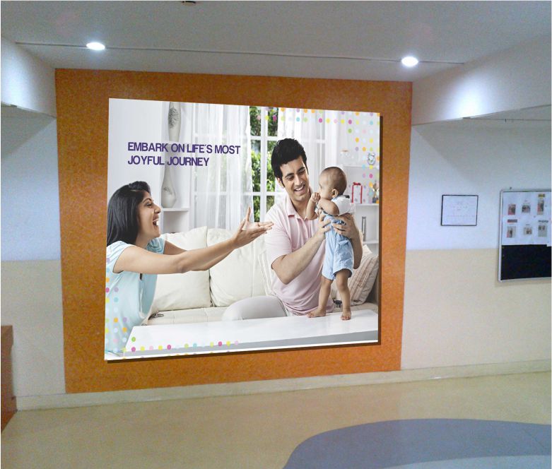
The space branding, peppered with happy, colourful, everyday
scenarios was specifically designed to kindle joy and hope
in the visiting children and parents.
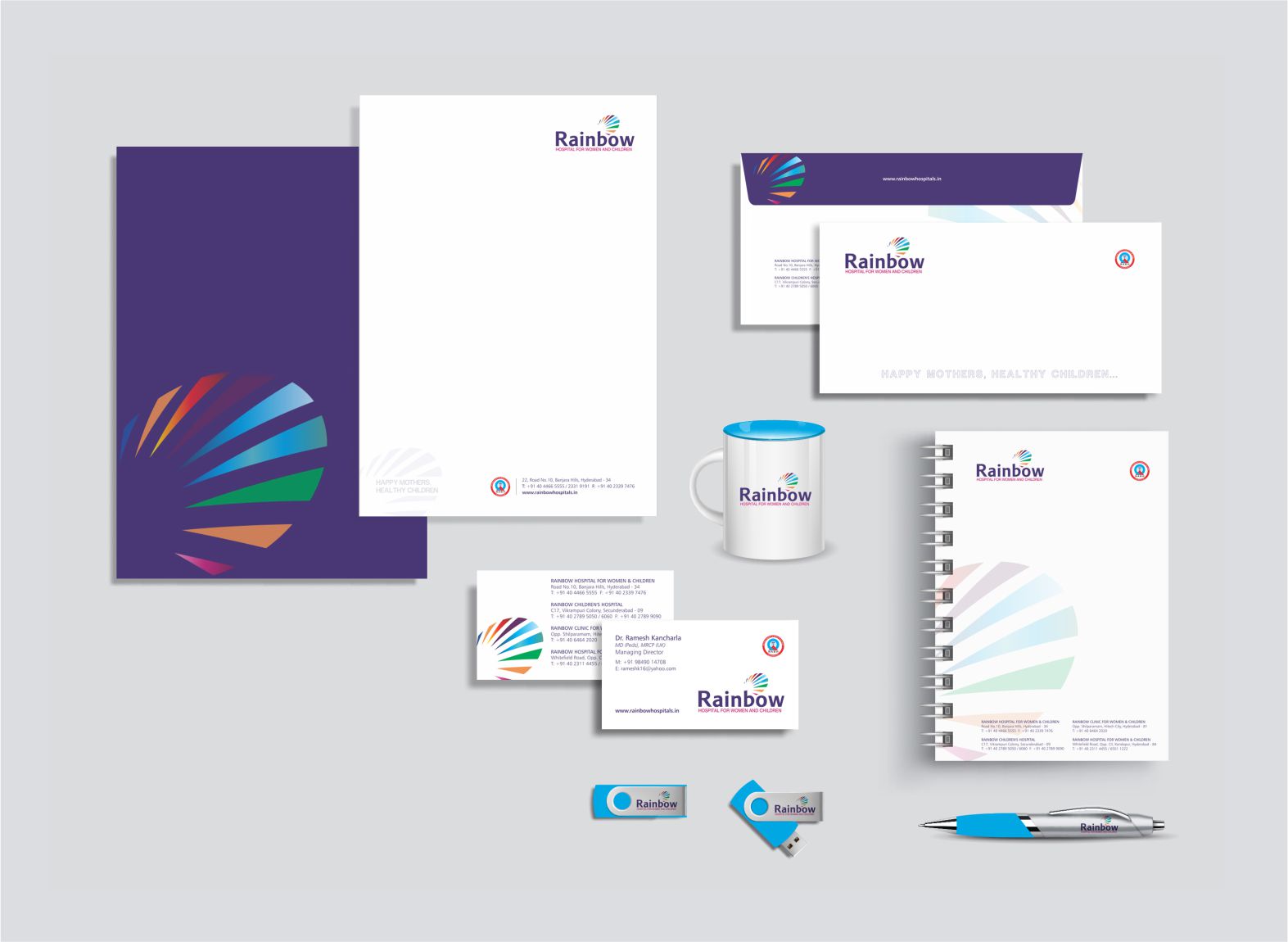
Vibrance plays a starring role in every communication
piece for both internal and external audiences.
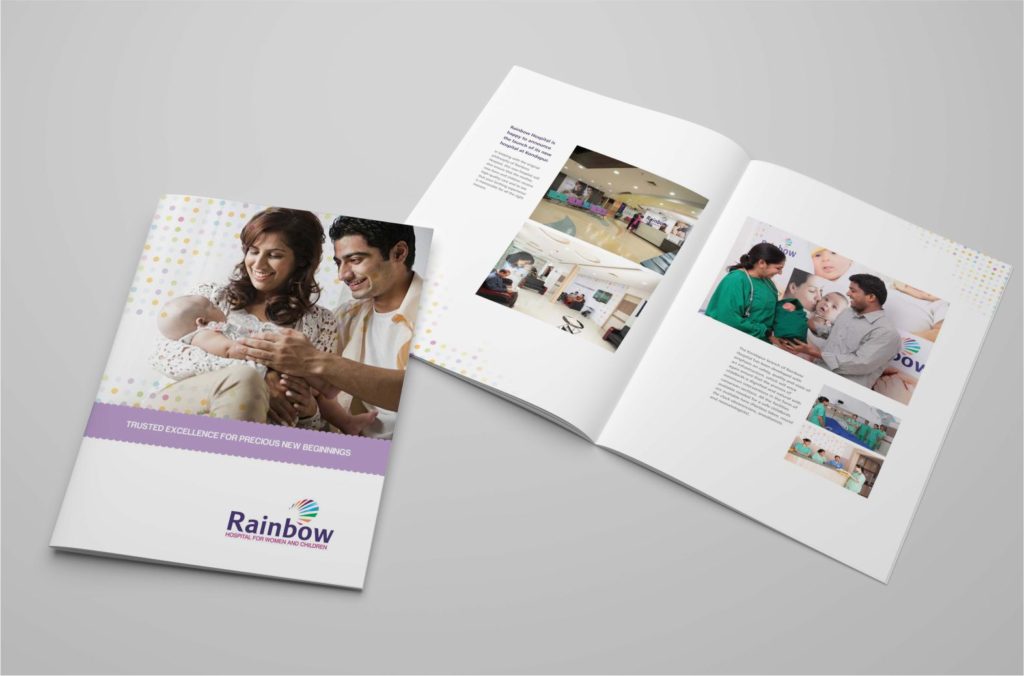
Custom photography was undertaken at site and the
evocative pictures were used in the brochure and website.
